COVID-19's Impact on Airport Traffic
Project Information
- Category: Public Health Analytics / Mobility Data Analysis / Data Visualization
- Client: Quantum Analytics (Internship Project)
- Project Date: Nov 2023
- Tools Used: Tableau, Microsoft Excel
- Data Source: Geotab (geotab.com) - Publicly available airport traffic volume data
- Project URL: View on Tableau Public
COVID-19's Impact on Airport Traffic: Analyzing Post-Pandemic Mobility
Summary
As part of Quantum Analytics internship, I analyzed COVID-19's impact on airport traffic volume. Using publicly available Geotab data, which provides traffic volume as a percentage of a pre-pandemic baseline (Feb 1 - March 15, 2020), my project focused on creating a dynamic geospatial visualization to illustrate changes in airport activity. This involved tracking traffic decline and subsequent recovery, identifying key mobility patterns. This project demonstrates my ability to interpret and visualize dynamic, real-world data to provide insights into significant global events and their economic repercussions on the aviation sector.
1. Introduction: Tracking the Aviation Industry's Response to COVID-19
The COVID-19 pandemic significantly disrupted air travel. My Quantum Analytics project analyzed airport traffic volume using Geotab data, which tracks traffic as a percentage of a pre-pandemic baseline (February 1st to March 15th, 2020). The core objective was to create a dynamic geospatial visualization demonstrating the impact and recovery patterns. This analysis offers valuable insights into the resilience and evolving landscape of global air travel.
2. Project Objectives & Goals
My project aimed to extract and visualize critical insights from the Geotab airport traffic dataset:
Overall Objectives:
- Analyze and visualize the decline and recovery of airport traffic volume post-COVID-19.
- Identify geographical patterns and hotspots of impact and recovery across different airports.
- Illustrate traffic volume as a percentage of the pre-pandemic baseline.
- Demonstrate the creation of dynamic geospatial visualizations for real-world mobility data.
Project Goals & Deliverables:
- Dynamic Geospatial Visualization: An interactive map showcasing airport traffic changes over time, with filters for specific regions or time periods.
- Time-Series Analysis: Charts illustrating the trend of airport traffic volume (as % of baseline) over months.
- Comparative Analysis: Visualizations comparing the impact on different airports or regions.
- Key Metrics Display: Dashboard elements showing average traffic percentage, peak decline, and recovery milestones.
- Interactive Dashboard: A comprehensive Tableau dashboard for exploring the dataset.
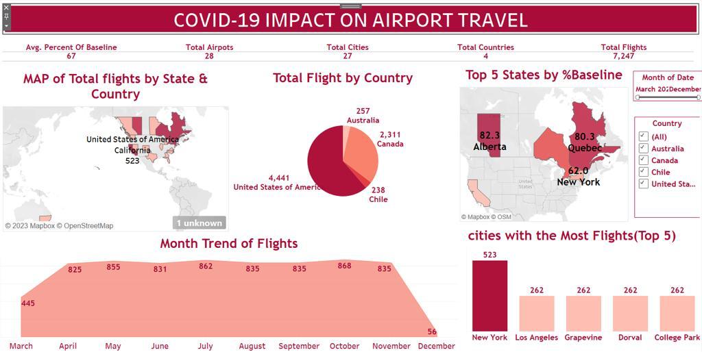
3. Data Scope & Metrics
The project used publicly available Geotab airport traffic data. This dataset measures traffic to and from airports as a percentage of baseline volume (February 1st to March 15th, 2020). Key metrics and attributes included: **Airport/Location**, **Date/Month**, and **Traffic Volume (% of Baseline)**. The focus was on leveraging this percentage-based metric for understanding the pandemic's relative impact and recovery pace across the global airport network, culminating in a powerful **dynamic geospatial visualization**.
Key Insights Derived from Data:
- Sharp Decline in Traffic: Visualization clearly showed a significant drop in airport traffic volume.
- Varied Recovery Rates: Different airports and regions exhibited diverse recovery patterns, highlighting regional policy impacts and travel restrictions.
- Persistent Impact: Some airports may still be operating below baseline traffic levels.
- Importance of Baseline Comparison**: The percentage of baseline metric provided a clear, standardized way to compare current traffic to pre-pandemic norms.
- Effectiveness of Geospatial Visualization: The interactive map allowed immediate identification of severely impacted or recovering regions.
4. Dashboard Design & Key Insights
My Tableau dashboard narrated COVID-19's impact on airport traffic through intuitive and interactive visualizations:
Dashboard Features and Insights:
- **Interactive Geospatial Map**: A central map showing airports, with color intensity or size representing traffic volume as a percentage of the baseline, dynamically updating with date filters.
- Time Series Charts: Line charts displaying the trend of average traffic percentage over time, potentially broken down by country or region.
- Top/Bottom Airports: Bar charts highlighting airports with the highest and lowest traffic percentages compared to the baseline.
- Key Performance Indicators (KPIs): Summary cards showing overall average traffic percentage, maximum decline, and current recovery status.
- Interactive Filters: Date range, country, and airport filters for granular exploration.
- Tooltip Details: Informative tooltips on hover for each airport (e.g., specific percentage, date).
The dashboard serves as a crucial tool for understanding the evolving landscape of air travel and the uneven recovery patterns.
5. Technical Approach & Tools
This project leveraged a direct, data-driven approach:
- Data Acquisition: Sourced from Geotab (geotab.com), providing monthly updates on airport traffic volume as a percentage of baseline.
- Data Preparation (Microsoft Excel): Initial review and minor cleaning were performed to ensure data integrity before loading into Tableau.
- Dynamic Geospatial Visualization (Tableau): The primary tool for creating the interactive map and other charts. This involved:
- Connecting to the Geotab data.
- Utilizing geographic roles for airport locations.
- Creating calculated fields to represent the "Percentage of Baseline" metric clearly.
- Designing interactive elements like time sliders and filters for dynamic exploration.
- Exploratory Data Analysis (EDA): Initial observations in Excel and Tableau's data pane helped understand the data's structure and identified periods of sharp decline and gradual recovery.
- Data Visualization & Dashboarding (Tableau): Building the comprehensive dashboard, including time-series charts, bar charts, and KPI displays to complement geospatial insights.
6. Impact & Business Value
This project offers significant value:
- For Aviation Industry Stakeholders: Provides clear, dynamic insights into the impact of global events on air travel patterns, aiding in recovery planning and resource allocation.
- For Public Health Researchers: Offers a visual representation of how a global health crisis directly affected mobility and economic sectors.
- Demonstrates Data Visualization Expertise: Highlights proficiency in creating compelling and interactive dashboards, especially dynamic geospatial visualizations, from complex real-world data.
- Supports Economic Analysis: Enables understanding of the economic recovery patterns in the travel and tourism sectors.
- Storytelling with Data: Illustrates the ability to transform raw data into a clear and impactful narrative about a major global event.
7. Conclusion
My "COVID-19's Impact on Airport Traffic" project at Quantum Analytics provided a crucial lens to understand the pandemic's effects on global mobility. By leveraging Geotab's traffic data and focusing on a dynamic geospatial visualization in Tableau, I effectively illustrated the dramatic shifts in airport activity. This project enhanced my skills in interpreting real-world, time-series data and creating interactive dashboards that deliver actionable insights into critical global events, showcasing my capabilities in data analysis and impactful visual communication.